Estrella de Oro
PREFACE: Naming, Brand identity & strategy, art direction
Chapter 1: Company naming, brand logo, icons, business card, email signature
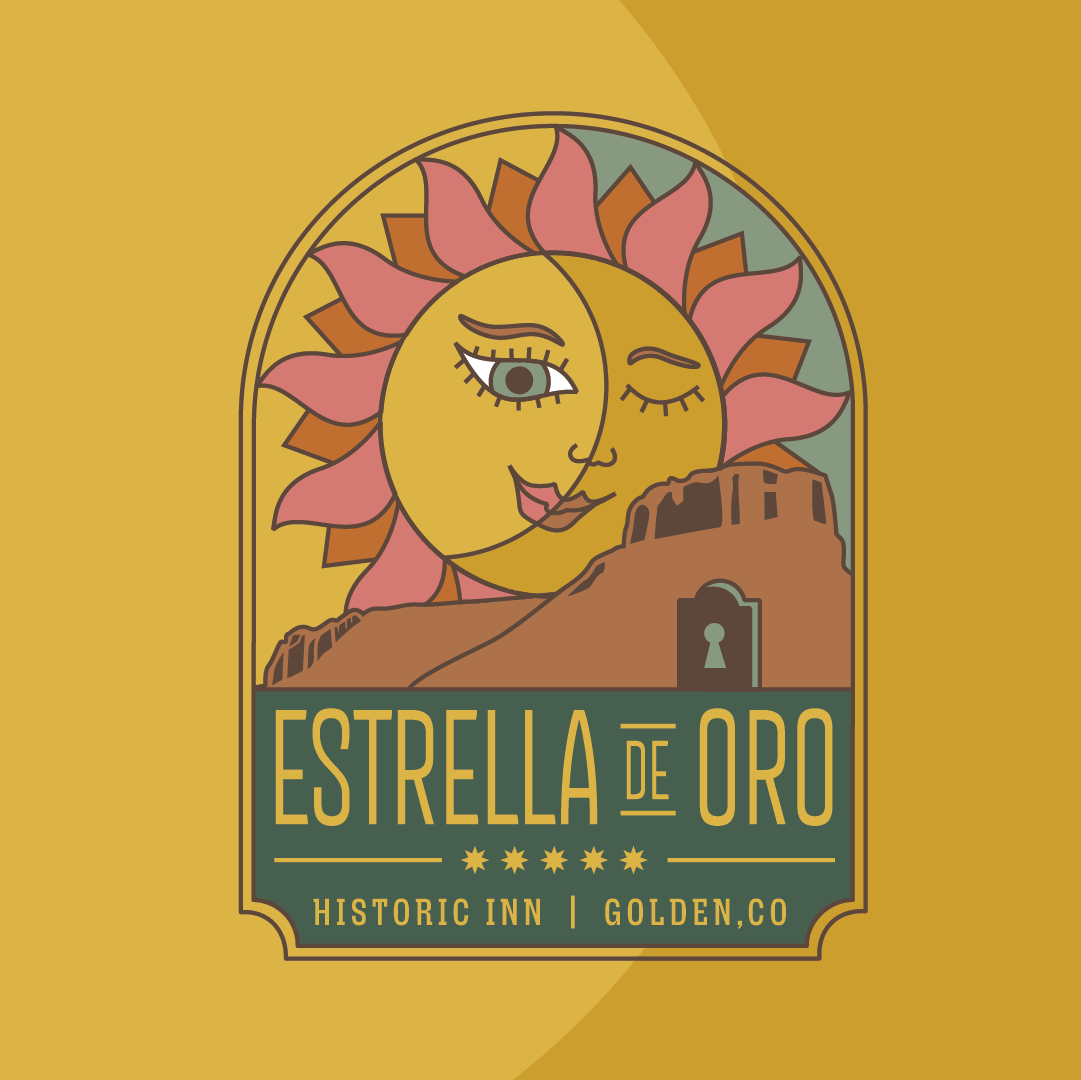
FOREWORD: Two powerhouse women of Golden took on a big endeavor. They bought an inn. A Historic Inn. The wondrous Stagecoach landmark is nestled in downtown Golden (behind my most favorite brewery Mountain Toad). Titled Estrella de Oro Historic Inn (Spanish for Golden Star), the name honors both the property's location in Golden and the star-bright hospitality that has always defined it. www.estrella-de-oro.com
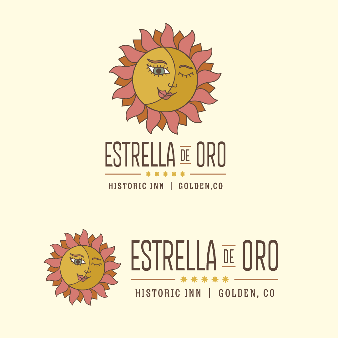
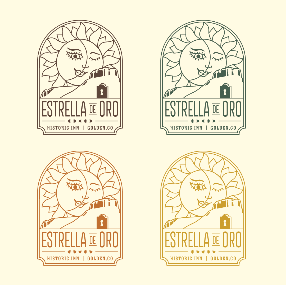
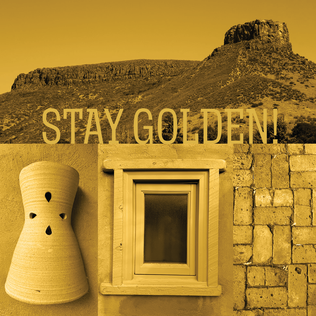
SETTING: This brand identity is one of my favorites (on par with Amanda’s The Whicker Hive, her food truck management biz: see logo in “more art”). This logo mark represents the town of Golden and it’s South Table mesa landmark, EDO’s soutwest vibes and door shape, as well as the sun and moon to symbolize the overnight service. Her name is Stella.
The story of two friends coming together to preserve history and create a new future. Stars have long been used to designate the quality of a lodging establishment and our “Gold Star” represents the highest level of dedication to detail and experience.